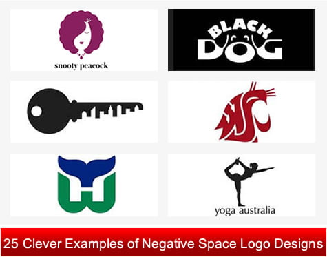
Logos are the cryptogram stands as a professional identity in the market conveying right business among people. When used effectively, Negative Space or White Space is one of the most important design elements that help designers to logos different from other so people remember it in the long run. White space is all about applying creative approach cleverly to define the edges of the positive space.
Negative is actually Positive! To create the magic of negative space in a logo one has to work with clever eye to balance the negative space of a design positively which can be utilized to convey the real message effectively.
As per the latest logo design trends, Negative space is the most positive design element that has been employed cleverly by logo design experts to create conceptual and unique logos by successfully balancing the white and positive spaces. Many logo designers have utilized the negative space to create great logotypes with excellent visual effects, subtle 3rd dimension, layered look which appear more interesting to the visitors eye. The “A” and “O” in the Eaton® logo and the “Samsung®” name are the best examples of brilliant usage of Negative Space.
Negative space is nothing but successfully balancing the negative and positive spaces in the logo designs. In this post, we have compiled a best collection of logo designs created by great designers by using different creative technique of negative space artistically. Here, you will see a clever use of negative space applied as an active part of the design.
What is Negative Space?
Negative Space is also called white space referred to an empty space around and between the solid colored graphics of any image which is not occupied by content that may contain gradients, patterns or background objects. Negative space if used positively to design logos help in reducing the color amount. White space into a logo is the most essential design element that helps logo design experts to make maximum visual impact with the simplest possible elements. It is the design factor which is basically not easily recognizable. The creative use of negative space in logo design can add lots of interesting visual effect and uniqueness along with minimal designing. As per designer point of view, a great creative concept can be created by simply capitalizing the negative space. Most of the logo designers are using the white space cleverly and artistically to design creative and visually appealing logos. Logotypes created by perfect use of negative space just not only create visual harmony but also produce optical illusions.
Regular tips to create logo design by using negative space
Creating logotype by using negative space is not as easy as it sounds because it involves lot of experimentation and sketching. A designer have to arrange text and objects artistically in an attractive, logical, and functional manner to give a custom logo design a simple, attractive, unique and creative look. Below, we have put together a shortlist of some regular tips to be taken into consideration while designing logotype by using negative space. Take a look:
1. You should stick to simple white space carved logo designs that are capable to actively engage targeted set of visitors.
2. It is pre-requisite to first analyze negative space before creating a logotype.
3. While using white space keep your logo design in a basic wireframe
4. You must always go for logical distribution of negative space for positively perfect use of white space in action.
5. There is no thumb rule that the color of “Negative Space” have to be white instead it can be of any color.
Showcasing Awesome Logo Designs Using Negative Space Brilliantly
Here, we have put together a beautiful collection of Inspiration Negative Space Logo Designs showcasing several tricks of negative space used by different designers.
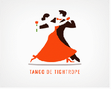
TANGO DE TIGHTROPE
NETMEDIC
SYNERGY EQUITIES
STAR DENTAL
EIGHTBONES
KINGSBURY
SHOELESS
ONEPLUS
PENDULUM
ADOBE
MODERN ALIEN
SECRET OF FASHION
PENCIL
BRAND UNION
BISTRO
PREMIER CATERING LOGO
WWF
NEXCITE LOGO
QUOTE KID
HELPING HANDS FOR PETS
PAINT THE CITY
BABELFISH LEGAL
WOODENHOUSE
ATACK
MARTINI HOUSE
OPTICAL ILLUSION FACES CHALICE
EGG-N-SPOON
CAFÉ MELODY
OGDEN PLUMBING
GIRL SCOUTS OF AMERICA
NBC
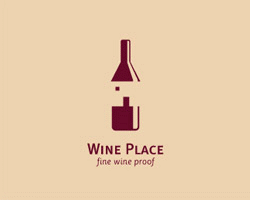
WINE PLACE
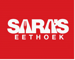
SARA’S EETHOEK
TOWN CHECK-UP
CHICKEN GOURMET
CHERIE
HEARTY
WEST BRIDGE
KCREATIVE
Further Resource
Negative Space http://en.wikipedia.org/wiki/Negative_space
Clever Examples of Negative Space in Logo Design http://webdesignledger.com/inspiration/clever-examples-of-negative-space-in-logo-design
Clever Logo Designs That Speak For Themselves http://www.noupe.com/showcases/clever-logo-designs-that-speak-for-themselves.html
Negative Space in Webpage Layouts: A Guide http://sixrevisions.com/web_design/negative-space-in-webpage-layouts-a-guide/
- Introducing the Apple AirTag - July 20, 2023
- Slavish Thinking: غلامانہ سوچ - April 27, 2017
- Android is expected to welcome BBM before October - July 21, 2013






No Comments Yet