Samsung Galaxy S6 Edge review – Striking curved design makes this the S6 to crave
Introducing the latest Samsung Galaxy smartphones, the Galaxy S6 & Galaxy S6 edge review. Next is Now !
The Good The Samsung Galaxy S6 Edge’s wraparound screen transforms an already great phone into Samsung’s best-looking handset. Ever.
The Bad That supercool design comes with a big price tag, and the screen doesn’t deliver any real killer apps. Like the regular S6, the Edge doesn’t support swappable batteries or expandable storage.
The Bottom Line Samsung’s striking, high-end Galaxy S6 Edge has the beauty, brains and brawn to take down the iPhone 6 and all the Android competition.
9.0 Overall
The Samsung Galaxy S6 Edge is the Ferrari to the Samsung Galaxy S6‘s BMW, the Chanel handbag to the S6’s Coach. OK, so maybe the differences aren’t that extreme, but you get the point. The S6 Edge earns its right to be called the designer version of the S6, and you’ll pay a premium for it.
Its two rounded sides create a bold, innovative design that isn’t just the first commercial dual-curved display, it’s also probably the best screen on a phone today. And although the S6 and S6 Edge share every major spec and nearly every color, it’s the S6 Edge that looks and feels like a completely different — and far more upper-crust — device. This is the Android phone you want to buy.
That is, until we get to the nitty-gritty: the real money involved. Australian carriers and retailers haven’t announced pricing yet, but in the US, the Edge costs $100 more than the S6 on contract, and about $100 to $130 more off-contract, with $100 bumps for each storage size. That’s as much as a 19 percent difference over the S6. In the UK, the 32GB S6 Edge is priced at £760 compared to the S6’s £600, a 27 percent premium. In other words: prepare to pay up for this sexy design.
Your choice here could well come down to paying more for the Edge’s cutting-edge shape, or putting that extra cash towards step-up S6 models with more storage. The good news is that the nearly hardware-identical standard Galaxy S6 is pretty spectacular on its own, and you’re not missing out on much if you pass up the Edge in favor of the better-value S6.
So, stick with the S6 if you want your money to go further, but for the more luxurious and distinctive phone, it’s the Edge all the way.
The S6 Edge: Like the S6, in a far prettier package
Releasing multiple variants of its Galaxy phones is old hat with Samsung. But 2015’s Galaxy S6 line is the first time the company has announced and released two sibling models simultaneously. Make no mistake, though: the hardware differences between the two handsets are mostly skin-deep.
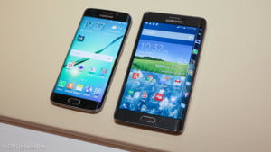
Where the S6 has straight sides, the S6 Edge tapers on its right and left sides, where the curved portion of the screens arc to meet the back. Though it feels slimmer, the Edge is a hair thicker in its fattest part, but also a tad lighter. The power button and nano-SIM card slot also move up top on this variant.
Samsung Galaxy S6, S6 Edge dimensions
| Galaxy S6 | Galaxy S6 Edge | |
| Dimensions (inches) | 5.6 x 2.8 x 0.27 | 5.6 x 2.8 x 0.28 |
| Dimensions (millimeters) | 143.4 x 70.5 x 6.8 | 142.1 x 70.1 x 7.0 |
| Weight (ounces) | 4.9 | 4.6 |
| Weight (grams) | 138 | 132 |
The Edge also has a slightly higher capacity battery, presumably to work with night mode on the Edge display: 2,600mAh on the Edge versus 2,550mAh for the standard S6. The Edge gives us an average of 13.5 hours of battery run time in our looping-video tests, an hour over the S6’s 12.4-hour average. Keep in mind that these tests don’t take into account real-world longevity, especially if you’re constantly using the Edge screen features, like night mode.
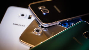
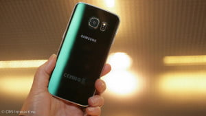
While both the S6 and S6 Edge are available in gold, black and white, Samsung throws in some color to each lineup. The Edge’s portfolio gets jewel-toned emerald green, while the S6 springs for topaz blue.
Design: Two curves really are better than none
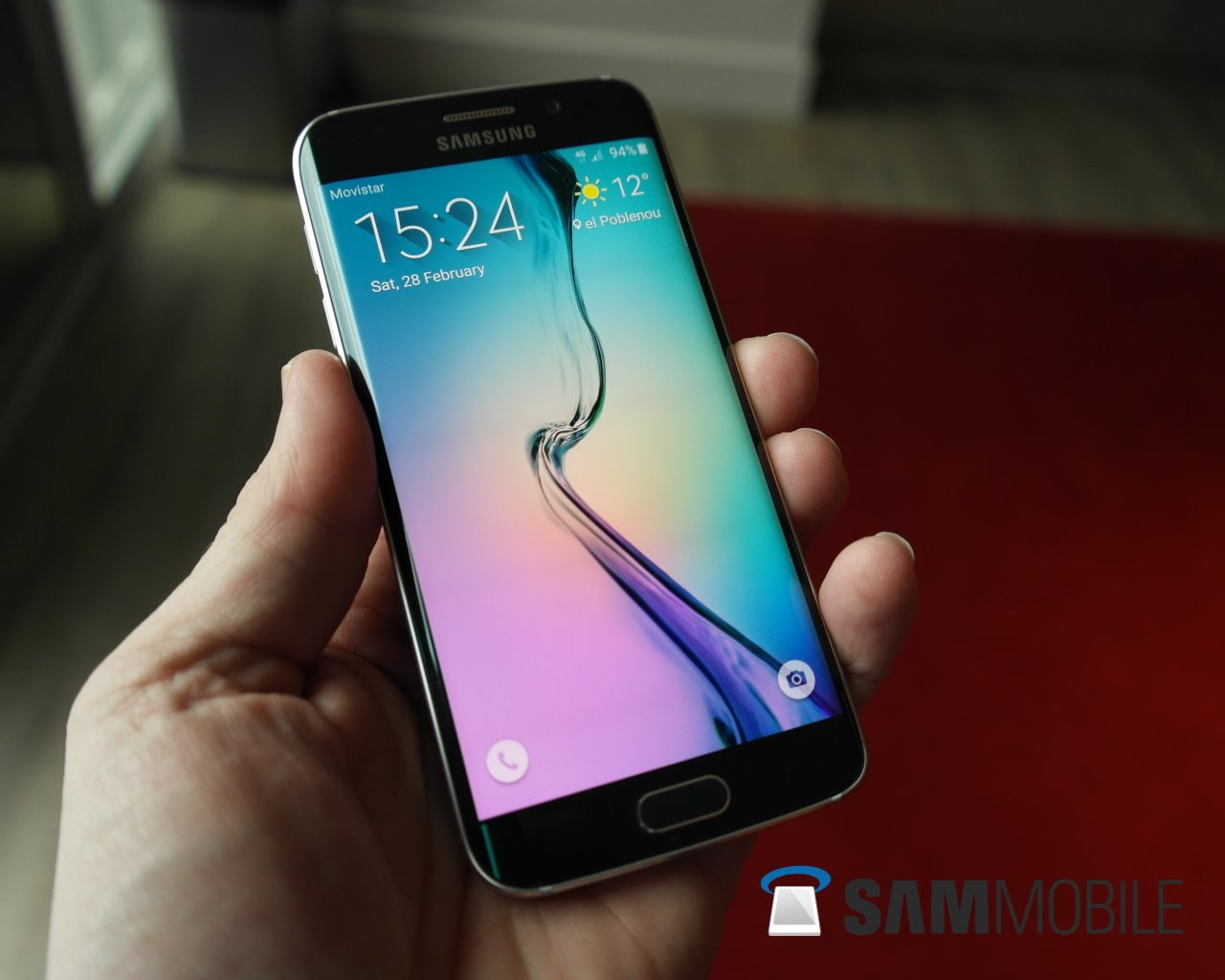
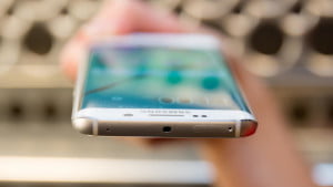
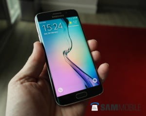
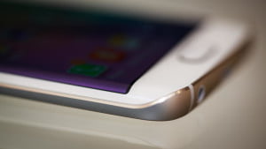
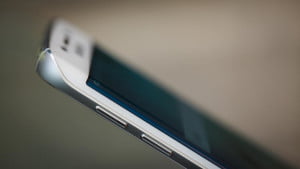
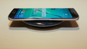
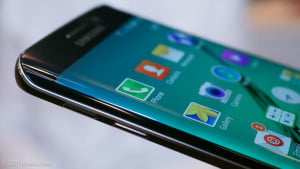
Rounded glass on the left and right sides of the 5.1-inch metal-wrought Galaxy S6 Edge give this phone its name. The curved portions of screen meet the phone’s back to form symmetrical ridges on either side and a kind of flattened bubble effect on the glass itself.
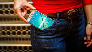
This actually works out better than it sounds. Its unique shape pops, giving it plenty of in-hand appeal. The phone feels aggressively slim, yet balanced, and the sharper sides provide a surprisingly solid grip.
While I had no problem fumbling the device, all that slim glass gives it a much more petite and delicate look and feel than a lot of other phones. You may feel more comfortable protecting all that investment in a case. Unfortunately, there aren’t a ton of options at the time of this writing (but I’m getting in a gaggle of cases to find my favorite, and will update y’all soon.)
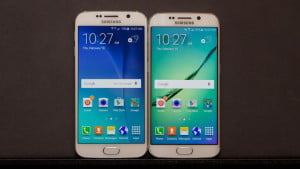
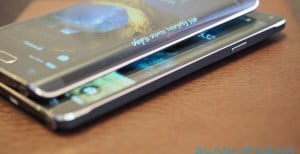
Compared with the S6’s familiar rectangular shape, the S6 Edge is palpably modern and chic. If you’re wondering, the Note Edge felt the same way despite its asymmetry, though I like the way this Edge looks even more.
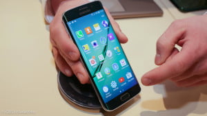
The curved display isn’t only an aesthetic affectation, either. Navigating around the S6 and the Edge side-by-side in real life produces more lifelike icons and images than when viewing them on the flat S6 display. (Alas, this doesn’t translate well in a photo.)
The concave Galaxy Round, which is sold only in South Korea, had some of this effect, too. When reviewing that phone, the screen’s deeper bend occasionally caused a parallax problem, one that the S6 Edge seems to avoid since most of its surface is flat.
- How to Monetize Your Facebook Page: A Comprehensive Guide - July 22, 2023
- Avoiding Plagiarism: Your Ticket to Originality and Academic Success! - July 21, 2023
- Chat-GPT: Your Friendly AI Pal for Awesome Conversations! - July 20, 2023



No Comments Yet