What’s coming for your iPhone and iPad with iOS 7
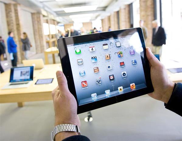
Apple’s Worldwide Developers Conference kicks off on 10 June and among the things we expect to see unveiled is iOS 7, the latest edition of the operating system for the iPhone, iPad and iPod touch. Apple CEO Tim Cook recently revealed that iOS 7 could be a drastic departure from the iOS we’re used to, with Apple’s British-born design chief Sir Jony Ive taking the helm and steering the user interface and look away from skeuomorphism and taking a more minimalist approach. “What is skeuomorphism?” we hear you cry. Well, on the digital front it’s a design approach that incorporates the look of real-life materials and textures as a way to add familiarity. In the case of iOS, this means on-screen buttons and sliders that appear to be made from shiny metal, Game Center’s green baize table or the calendar’s liberal use of leather. How might Apple reinvent iOS? Read on and find out…. (Please note, a lot of the images used in this gallery are concept designs and not official shots of iOS 7)
iOS 7: New look, new feel
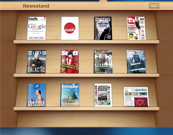
Apple- Firstly: why the move away from skeuomorphism? Given the huge success of iOS, doesn’t Apple run the risk of killing the golden goose by switching up its approach? While the late Steve Jobs and previous iOS design leader Scott Forstall were big proponents of skeuomorphism due to its ability to clad new user interfaces in the clothes of old, familiar ones, Jony Ive is not a fan. He reportedly feels that physical metaphors in software design do not stand the test of time. An example: remember when iTunes’ desktop icon used to be a CD? Apple changed that because most people don’t listen to CDs anymore (they buy digital music on iTunes instead). In 10 years, most kids will probably never have listened to a CD in their lives. So Apple replaced the iTunes icon with a blue circle containing musical notes – it’s far more timeless. This is the approach Ive wants to take and run with for the future of iOS. So it looks like goodbye for the wooden Newsstand ‘shelf’, the yellow notepad, and other ‘real-life’ iOS graphics.
iOS 7: The Lock screen
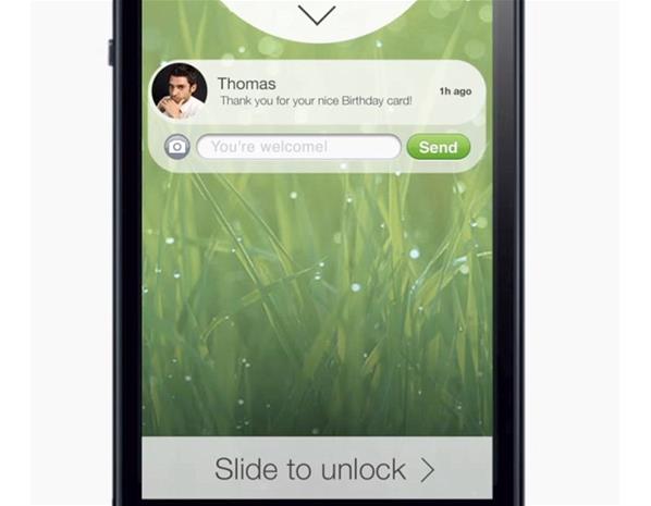
Apfellike.com- The Lock screen hasn’t changed a great deal since Steve Jobs first performed the slide-to-unlock gesture at the iPhone’s unveiling back in 2007, but iOS 7 will reportedly see it given a significant revamp. According to 9to5Mac, the glossy transparent clock and date bar at the top of the screen will be ditched and replaced by a non-shiny black bar, while the pin code grid’s square buttons will be replaced by circular black buttons with white text (you’re going to see this shift to a black and white trend a lot in iOS 7, apparently). While it’s not quite the same as the predictions suggest, Jurgen Ulbrich from Apfellike.com has made a concept video detailing his vision for a flatter looking lock screen that also includes interactive messaging notifications.
iOS 7: Notifications
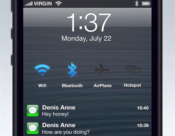
imjeanmarc- Also rumoured to be getting the flat black and white treatment is the iOS notifications panel, which currently rocks a skeuomorphic cloth-textured background. This will be replaced by a flat black or dark grey panel with white text. Again (assuming the sources are correct) the digital metaphors and shininess are being stripped out in favour of something much flatter and arguably cleaner: think Windows Phone, with its flat, colour-block tiles. There’s also a chance we’ll see a lot of extra interactivity built into the notifications panel, and more access to information at a glance. So there might be weather info and localised news feeds included – a little like the notification bar widgets on Android. There may also be a panel to quickly let users access Wi-Fi and Bluetooth controls, and to toggle Airplane Mode on and off.
iOS 7: The Homescreen
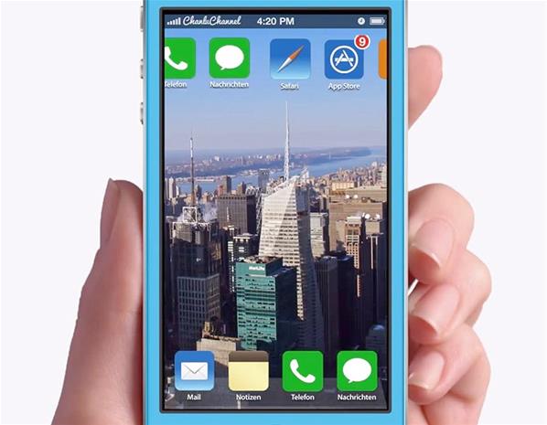
ConceptsiPhone- The iPhone’s icon-mosaic of a homescreen is undoubtedly iconic – so much so that it spawned a thousand rip-offs and almost as many lawsuits – and Apple isn’t likely to change its layout too drastically in iOS 7. According to 9to5Mac, it’s again the gloss that’s going as Ive and co seek to impress a uniform visual flatness across everything. Shine and shadows are being removed from the dock at the foot of the screen, and also from Apple’s own app icons like Camera, Photos and Clock. But in most respects the Homescreen will look similar and work similarly to its current incarnation. One other thing picked up on in 9to5Mac’s report is panoramic backgrounds. You’ll apparently be able to set panoramic images as your wallpaper (we assume Apple will include some of their own photos too) and have the image scroll left to right as you swipe through the various homescreens.
iOS 7: Apps
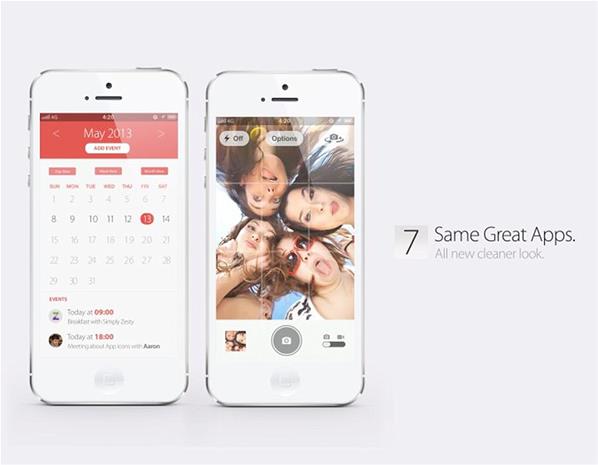
Simply Zesty- Not only will the home screen icons look different, but most of Apple’s own apps will have undergone a major cosmetic reworking. Again, the idea is to make them fit into the new flat, colour block aesthetic. According to sources familiar with Apple’s plans, apps like Mail, Calendar, Messages and Maps will each boast a largely white base, accented with a different respective colour scheme. So Calendar might be flat white for the most, with red headers and accent text – a little like the concept above from Simply Zesty. Other sources claims that the changes aren’t quite as drastic as in this image, however, as Apple is keen not to scare away existing users. Reports claim the Weather app will gain animations to indicate different types of weather, while Game Center’s much-hated green felt will be ditched, along with the wooden shelf effect used in iBooks.
iOS 7: Improved in-car features
Ford- iOS 7 will reportedly usher in a raft of new in-car integration for iDevices, with improvements for Siri and Maps front and centre. The idea will be to get car manufacturers on board too, allowing iPhones and iPads to slickly interact with in-car entertainment systems. This could take the form of screen mirroring from an iPhone to a car’s built-in TV screen, allowing Apple Maps to appear there where it’ll be far larger and easier to see when you’re behind the wheel. Siri will be used to communicate with and control the iOS device hands-free. 9to5Mac cautions that, while these improvements are in the works and will likely be introduced during iOS 7’s reign, its sources believe that they’re still some way off. Maps, as we know, is still widely regarded as an uncharacteristically poor Apple product and the company will want to ensure it’s up to the task before introducing a “proper” in-car integrated mode. So it could be that we don’t get a big reveal for a few more months.
iOS 7: Apple AirDrop
Apple- Rumours also persist that Apple is planning to introduce the AirDrop file-sharing feature (currently available on Macs running OS X Lion) to iOS 7. AirDrop currently allows users to quickly transfer a file from one Mac to another, nearby Mac, without them needing to share the same Wi-Fi network. According to MacRumors, the feature is being tested internally at Apple with a view to bringing it to iOS 7, meaning someone using an iPhone will be able to swiftly send a photo, document or other small file to their or a friend’s iPad (and possibly Mac) without needing to fuss with iCloud synchronisation, email or third party services like Dropbox.
iOS 7: More open?
Getty- One thing Apple has strongly maintained over the years is iOS’s “walled garden” approach: when it comes to software and user interface, you’re shut inside a carefully and strictly regulated experience. You can’t, for example, install apps from anywhere other than the iTunes App Store, and every app there has passed a rigorous set of Apple checks. The idea is to ensure a great customer experience at the expense of a little freedom. At the All Things D conference recently, Tim Cook that this could change. A little bit. Don’t expect to be able to install unapproved apps (unless you jailbreak your device), but as for the ability to make changes to core components of the UI, such as the keyboard or home screen? That could happen. “I think you will see us open up more in the future,” said Cook. “But not to the degree that we put the customer at the risk of having a bad experience. But will we open up more? Yes.”
iOS 7: Deeper social network integration
Corbis- Previous iOS updates have added deeper Facebook and Twitter integration into the mix, and iOS 7 is reportedly set to continue this trend, albeit with slightly less popular social networks. According to a few outlets, Flickr and Vimeo are getting the integration treatment, allowing iOS 7 users to sign into these networks using their iPhone or iPad’s Settings application. Users will be able to share photos stored on taken on their devices directly to Flickr, and most likely share photos taken in third-party apps like Instagram directly to Flickr with a single button press. Any Vimeo integration seems likely to work in the same way, by allowing video clips on an iDevice to be uploaded easily to the site – much as they can already be shared directly to YouTube.
iOS 7 what to expect
- Introducing the Apple AirTag - July 20, 2023
- Slavish Thinking: غلامانہ سوچ - April 27, 2017
- Android is expected to welcome BBM before October - July 21, 2013




No Comments Yet