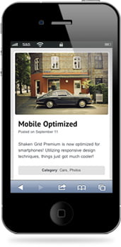
Shaken Grid is now smartphone optimized
We’re happy to announce a bunch of new updates to the Shaken Grid theme. The biggest update is the brand new responsive design that displays beautifully on smartphones. In addition to being smartphone optimized, Shaken Grid 2.0 now comes with Google Web Font options and a fresh new look. If you’re still running the lite version of Shaken Grid
Shaken Grid is a powerful portfolio theme with a fluid grid layout. The theme is extremely easy to use and customize. Post a video by simply copy and pasting the video’s URL from Vimeo or Youtube, or create an entire gallery by just uploading all of your images and hitting “Publish”…it’s that simple! Advanced post options include; changing the post box size, hiding post elements (title, content, slideshow), and changing the post’s individual page to be more minimalistic.
Easily Customizable and Packed With Features
With Shaken Grid’s built-in theme options panel you are able to upload your own logo, customize the look and feel of your site without touching any code, and many more possibilities.
Smartphone Optimized
This theme utilizes a responsive design, meaning it is now fully optimized for smartphones. Unlike some websites with mobile versions, this theme will not hide any of your content. Instead, it adjusts the design to place a heavier emphasis on the most important sections, while still displaying all of your site content (like the sidebar).
This theme includes:
- 5 unique page templates
- 8 color schemes (with the ability to customize these farther)
- 4 different grid box size options
- Video support
- Social networking options built-in
- 8 custom widgets (Flickr, Twitter, Popular posts, Category Posts, Share Buttons, Testimonials, Related Posts, Simple Ads)
- And much more!
- How to Monetize Your Facebook Page: A Comprehensive Guide - July 22, 2023
- Avoiding Plagiarism: Your Ticket to Originality and Academic Success! - July 21, 2023
- Chat-GPT: Your Friendly AI Pal for Awesome Conversations! - July 20, 2023
About The Author
Finally someone who sees the way it is. This post was really refreshing and it’s the key reason why I read your blog. Good job.
Thank you have for you blog, I look forward to reading your future posts
Congrats for submitting this type of valuable weblog. Your site isn’t just educational but in addition very inventive as well. Presently there tend to be unbelievably number of individuals who may compose not so straightforward content which wonderfully. Keep the excellent writing !!
Thank you Todd
decent look upon things. i dont think people realise how much mobiles affect us, ESPECIALLY in business.The next leap is mobile internet and the best online builder i have seen is without a doubt this one believe me visiting your business site and finding what you want quickly is such a pain on a mobile..this helped me fix this!
Thank for write something
Hey, This page can be quite helpful and fun to read. I am a huge follower of the things blogged about. I also love reading the comments, but it seems like a great deal of readers need to stay on topic to try and add something to the original topic. I would also encourage all of you to bookmark this page to your most used service to help get the word out. Thanks
Thanks I really appreciated….
F*ckin’ awesome things here. I’m very glad to see your post. Thanks a lot and i am looking forward to contact you. Will you please drop me a mail?
Thanks 😉
Hi there, You have done an excellent job. I’ll certainly digg it and personally suggest to my friends. I am confident they’ll be benefited from this web site.
Shaken Grid WordPress Theme by Shaken & Stirred Portfolio Theme is a sensible subject, trate with more attention.
do you wanna make money online ? or are you blogging for fun ? http://tinyurl.com/3j7o4mo if you want to get this course refrech the page and you will get a 10 usd discount. thank me later
I love your blog.. very nice colors & theme. Did you make this website yourself or did you hire someone to do it for you? Plz answer back as I’m looking to create my own blog and would like to find out where u got this from. thank you
Greetings from Ohio! I’m bored at work so I decided to browse your website on my iphone during lunch break. I love the knowledge you present here and can’t wait to take a look when I get home. I’m surprised at how quick your blog loaded on my phone .. I’m not even using WIFI, just 3G .. Anyways, excellent blog!
I just couldn’t depart your web site prior to suggesting that I really enjoyed the standard information a person provide for your visitors? Is going to be back often in order to check up on new posts
Hey siblings simply love your marvelous article and pls keep it up
Not a bad post,in fact really fine.but I really miss that you didn’t express your opinion in detail, but its ok you just have different approach to writing.
Thanks
Is this site a virus free? My computer give me an alarm
No way………… you are wrong Murphy… before visit my website… check my website link on Google, it’ll tells you about that web server or this domain or site has been infected with virus…. There is no virus on my site, even my hosting server……….
Check it again, Go to Symantec, AVG, ESET NOD32 or Avira where you can this website having virus or not….